Forest Rhapsody Rebrand Shoot


Forest Rhapsody is a skincare brand based on the foundation of plant-based bioactives.
I first connected with them via a lone cold email in 2022, and we ended working together on several projects. Recently, they reached back out, asking me to photograph their rebranded packaging.
The new branding is still inspired by the beauty and ancient remedies found in nature, with rich hues and vibrant textures, also highlighted in their new packaging design which uses a deep forest green and gold metallic lettering. Based on their brand guideline and notes, I set about creating imagery that would convey the mystical and the sublime, relying on nature elements, yet always letting the beautifully designed products shine on their own.

Good Earth
Described as “earthy, grounding, and restorative” on their website, my vision was to convey a warm earth landscape. I imagined monochromatic natural tones, but wanted the mix of textures from the rocks and sand to break up the surroundings and to add depth.
Lastly, to evoke a sense of restorative properties and a healing connection with the earth, I added a billowing cascade of smoke behind the jar, reminiscent of incense.

Milk Ferment
This cleanser harnesses the soothing properties of ancient grains and is meant to be calming addition to your skincare routine.
Based on that, I wanted to create a “milky” and dreamy environment for this product. I used semi-sheer fabric in the background, softly draped to form shadows and textures. The bottle is set on top of a cream colored stone slabs, giving it presence in the image. A scattering of rice grains below harkens back to the key ingredients.
Soft moody lighting add to the dream-like atmosphere.

Barrier Warrior
A fortifying gel meant to hydrate and protect your skin deserves to have the spotlight. In a somewhat literal sense, I placed the bottle so it would be backlit and on top of a pedestal, so it still stands strong and mighty, even amidst the large surrounding leaves.
With natural ingredients to boost skin’s luminosity and brightness, I also wanted to create a bright sunny light to the image. The blue background creates a nice contrast to the greens and can also be reminiscent of a sky on a sunlit day.
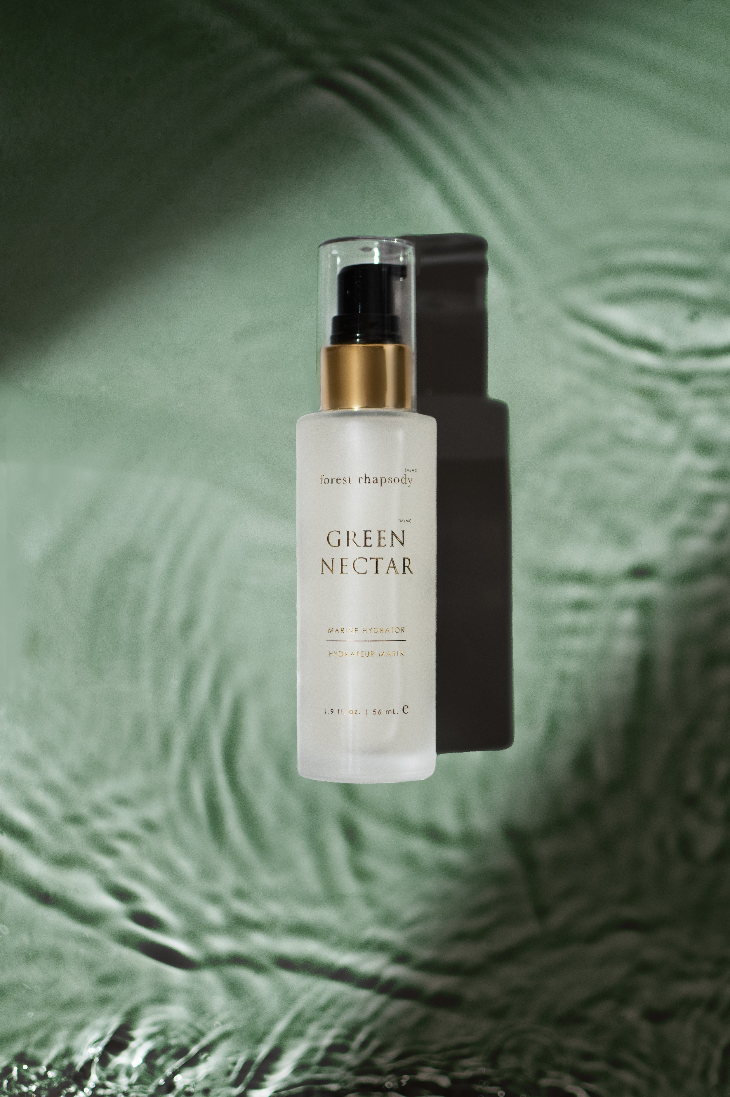
Green Nectar
Also described as liquid silk, that was precisely what I wanted to showcase in the image. Choosing to style only with water ripples and dramatic shadows, the simplicity of this shot is a nice reprieve from the other more styled images. It also focuses in on the product’s main hydration feature.
The water color is a deep sage color to reflect back to the product name, the packaging color, and inspiration from natural elements.

Thousand Petals
I took quite a literal approach to the styling, based on the product name. Meant to create petal soft skin after its use, I surrounded the jar with various types of flowers, all in soft and muted shades of pink and blush to match back to the product’s clay color.
The lighting is soft and warm-toned, and the darker slate background allows the colors of the product and flowers to really pop.
If you’re rebranding your product line and need updated images, let’s connect!
For more details on this shoot, as well as a behind-the-scenes look at how the images were styled, shot, and edited, please check out the vlog.
Interested in trying Forest Rhapsody’s products for yourself? Have a look at their website.